
Published on:

I have been thinking about a Rand Corporation study[1] that sought to explain, organize, and quantify the various trajectories of chronic illness that we commonly see today. The study classified elderly people who are approaching death into three different groups: one group dies after a short period of evident decline (a typical course of death from cancer); a second group dies after several years of increasing physical limitations, including episodic bouts of life-threatening moments that require hospitalization (common among those with chronic cardiac or respiratory disease); and a third group dies after prolonged dwindling over the course of many years (a typical course of death from dementia, frailty, or senescence).
The study used graphs to represent the typical “trajectory of decline” of those in each of the three groups who are ailing and approaching death. I have continually referenced this study while teaching my Aging & Public Health class at Shenandoah University because it offers important insights into aging, death, and dying processes.
If there’s one thing I’ve learned over the years of working with aging adults, it’s that every person has their own personal trajectory of decline, so a “typical” graph representation—such as those used in the Rand study—would not necessarily reflect what is actually happening with your loved one. When confronted with a health condition, some people defy the odds, while others unfortunately fare worse than expected.
However, as I’ve contemplated the Rand study, I find that the concept of charting out the declining health of a care receiver can be illuminating, so I would like to expand upon this approach. In doing so, let’s assume that each graph below represents one particular case, which is usually how family caregivers examine their personal circumstances.
Let’s consider the example of a person who has a chronic or degenerative condition, whose health is marked by ups and downs over time while slowly but steadily moving toward end of life. If we used a graph to illustrate this care receiver’s health condition over time, it might look something like this:
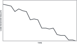
As you can see, the graph represents how one care receiver’s health condition evolves over time. In this example, the care receiver’s health is high at the start but steadily declines. The chart highlights how the person experiences intervals of acute functional decline, followed by relative plateaus or even slight improvements, on their way toward eventual end of life.
Upon charting the care receiver’s health condition over time, this graph becomes more illuminating if we incorporate a measure related to caregiving. Anyone who has heard me speak knows that I regularly teach how caregivers must adapt to the changing and evolving health conditions of the care receiver. This is a cardinal rule of effective caregiving. As the care receiver’s health declines, the caregiver must adapt by providing additional caregiving supports. Let’s add this dynamic element of caregiving to our graph.
I wish to introduce the term “caregiving intensity” to describe both the needs of a care receiver and the corresponding caregiving supports that are provided to the care receiver. Caregiving intensity is emblematic of the physical requirements of care. In a very literal sense, caregiving intensity is inversely related to the health condition of the care receiver. As a care receiver’s health decreases, caregiving intensity increases. If we used a graph to illustrate how caregiving intensity relates to our representative care receiver’s declining health condition over time, it might look something like this:
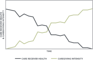
This graph conceptually represents the inverse relationship between the care receiver’s health condition and caregiving intensity. As you can see, when the care receiver’s health is high, caregiving intensity is low. However, as the care receiver’s health decreases over time, caregiving intensity must increase to a corresponding degree.
Graphically plotting these two items can strikingly reveal how, when, and how much a family caregiver’s life is impacted by the needs of a loved one requiring care. This approach could form the basis of a simple exercise at a caregiver support group, or as a discussion prompt for a family caregiver and their therapist, or as a method of private self-evaluation.
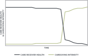
While every case is different, even a crude, hand-drawn graph may be illuminating in particular instances. For example, the graph may look something like this in the case of a care receiver who was relatively healthy and faces death quickly after the sudden onset of a terminal illness:
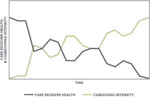
In the case of a care receiver who experiences intermittent, life-threatening episodes of acute sickness, followed by recurring recoveries, up through end of life, the graph might look something like this:
These graphs provide family caregivers and the professionals who support them a way to depict the trajectory of care-related experience over time. Because the relationship between care receiver health and caregiving intensity is clear, a graphical visualization of the interplay between these two dynamic elements of caregiving can generate insights and thought-provoking discussions about how to help not only the care receiver but also the caregiver.
What would your chart look like? I invite you to take a few minutes to draw a graph showing the trajectory of your loved one’s health condition over time, with an overlay line representing caregiving intensity. On your chart, you may wish to add dates of critical intervals of time during your caregiving experience. How would you chart your projected future caregiving?
Please note that there are more than physical implications to your chart of caregiving experience. Next month’s blog post will focus on how the dynamic relationship between a care receiver’s health condition and caregiving intensity is the driving force of the caregiver mindshift.
_______________________________________________________________________________________________________
If you’d like to invite Dr. Blight to lead a group discussion about charting the caregiving experience, please contact us.
- [1] The RAND Corporation. (2003) Living Well at the End of Life: Adapting Health Care to Serious Chronic Condition in Old Age. Retrieved from: https://www.rand.org/pubs/white_papers/WP137.html
Posted in Caregiving